Game Production Diary 5

For this week’s post, I’d like to write about my design of the boss arena, the interior and the end of our game.

For those of you who didn’t read my previous posts, where I think I mention the general ideas behind our game: my team is designing a game that will consist of the only level. Basicly, we try to deliver the whole narrative in one experience. Because of that, we need to finish our story after ending the only level of the game. This calls for more detailed planning of how the area where you fight the boss does look like.

ending_scenery_jpg

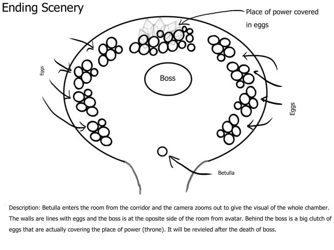
Here is a sketch I made to show my team the thinking behind the boss encounter environment. This sketch will be later used by the artists to create the arena of the boss fight and to explain to the programmer the behavior of the boss and the reasons behind my ideas (for example hitting the wall or the egg’s spawn).

So, we have a circular arena on the top a crystal tree. The visualization of this is tricky since we are technically inside the tree, but let us ignore laws of physics and space. In this room, I placed the throne that is the final destination of the avatar. Then I tried to show that we will cover the throne with props. The throne is going to be revealed after the boss dies by destroying props. All of this connects to the scene that player sees in the beginning of the game where the avatar leaves an old, depleted thrones behind in another tree.

With this we show the player the begging of our story, it’s progression via player’s play and, finally, how the story ends and resolves.

I find that having a miniture story shot ’em up game that contains a closed story cycle is an interesting idea. It’s so easy to create a story but only manage to introduce the player to the first chapter due to the production time limit. When you are a student it’s easy to overscope.

Please note this is one of my older artifacts, not something that was done directly this week 🙂

Game Production Diary 4

This was the last week before our beta demonstration. We finally got together all our assets into one large pile to get them into a comprehensive experience. I finally got some time with everything we have. And the construction of the level turned out to be an interesting thing to do (I never doubted that it will be).

untitled-1

I had only a general idea of how to structure our level. The task we have allows us to create games with only the first level. In other words, you get to play a level and see that there is more to come but here is where the game production ends. Our game, however, is a whole game in one level. So, we need to try and create an experience that feels complete. The progression curve of the challenge must feel natural. And so I set out to try and deliver this curve. I choose a simple method; add more monsters as the player reaches closer the end boss. One might think that this approach is fool-proof. But, later I realized that just filling the level blindly with mods has a flaw. I had no track of the time it takes to reach the boss. And furthermore, I want to be able to finish the level and the boss in the time given for beta presentation. And just like that, I ended up taking time of my own level run, trying to figure out how much intensity in mobs should there be. In the end, I settled on the time for a perfect game run to take around 3-4 minutes. This leaves a good margin for a run that is relaxed, given that the player knows the structure of the said level. This whole ordeal made me want to research a bit on how to measure the time resources from the designer perspective. Can a good game fit into a time that is under 5 minutes? How long is an average shoot ’em up level?

Game Production Diary 3

For more information on my game, please visit my first diary post, where I describe in more details the game we are working on.

For this week’s blog post I would like to discuss the incorporation of the same visual element in different places to intensify the aesthetic side of the game.

So, according to the narrative that we try to create, energy is everything in our game world. All living creatures consist of the same energy: the trees, the avatar, the enemies. This was the main reason for us to make the health of the avatar its ammunition. And it was during this week that I suggested using the same sprite for pick-ups and projectiles. Also, for something else, which we might not get to in the production process.

So here is a sketch of how I imagined this. To the left, we have a sketch of an energy flux players can get from smashing crystals while playing. And in the middle, I tried to sketch a projectile that would use the same sprite as the base. We will have to make it more projectile-like, but I hope you get the idea. The last picture is more narrative heavy and has to do with the ending for our little game. You can read details on the sketch itself. It againenergy_concept_jpg.jpeg 
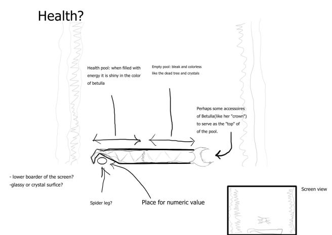
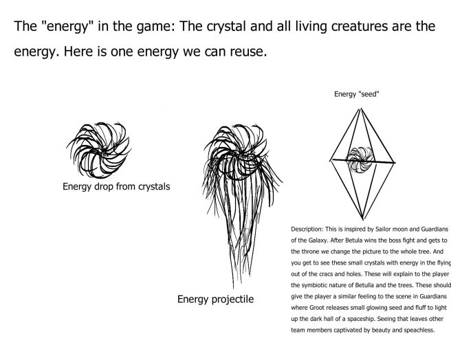
incorporates the energy flux sprite. What is the point of all of this? To enhance the filling, that everything in this world consists of the same matter.

Another theoretical step towards improving the aesthetic experience of the player is to make the avatars glow as she has more or less energy and when she picks more energy drops. I hope, that these elements will tie together nicely into a visual feast that I so desperately want our game to become.

Game Production Diary 2

This week all the groups presented their alpha builds. It was an exhausting experience to sit through around 20 presentations. But, thankfully, I didn’t leave that torture chamber without some insight about our own game.

in Game Design, you are always warned about how you will probably never get to build your own concept. But when a concept isn’t perfect, it allows you to pull at one loose string and unravel the whole thing into a lose pile of idea. You can reconstruct the concept from those ideas into something that is now in fact your creation. And that is what we did in my team; we took a wide, unclear world and reinvented it our own way. This allowed us to create a clear narrative for our game, which I think a lot of presentations lacked, as they followed the concept documents without much remaking. So why am telling this? Because I want to show you two sketches of our game menu. The reason for why there are two of them depends on how much of the rest of the game we can produce. And both menus have some narrative value.

Menu sketch number 1

start_meny_version2_jpg

In this one I tried to depict the crystal tree and its surroundings to give the player a better feeling of the world. It shows the structure of the tree and environment that is both beautiful and desolate. This is the menu I want for our game if we have time to make several art pictures that also introduce the player to our main character and the beginning of her journey. But this is a time-consuming process that is heavy on the artists and I am not all too sure they can manage this in time. So, we also need plan B for the menu.

Menu sketch number 2

start_meny_version1_jpg

In this one I wanted to have our avatar shown to the player as an introduction. The avatar is always facing away from the player in the game and that can make it hard for players to connect with her, especially since it’s a half-spider and arachnophobia is a real thing. So, if we can’t make scenes where we show the story of Betulla then we need, at least, to show the player her human side, how she gently touches the crystal, that she isn’t a monster you might think she is.


There is however a huge flaw in this approach – we leave the menu screen as the last thing for artists to make. If we can’t manage the story and must make a menu that shows Betulla, that is still a big chunk of work for the artists as this picture requires a lot of details on artistic level for it to connect with the player.

Game Production Diary 1

health_bar
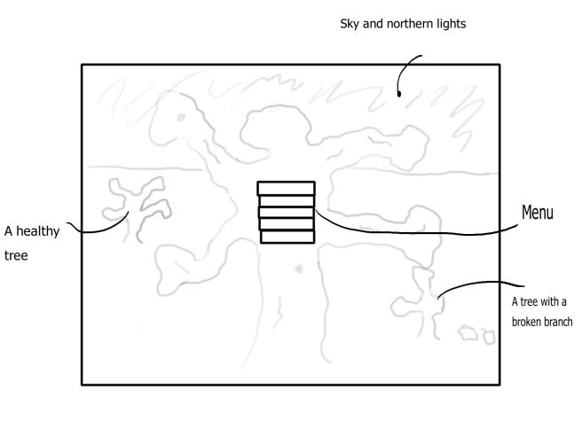
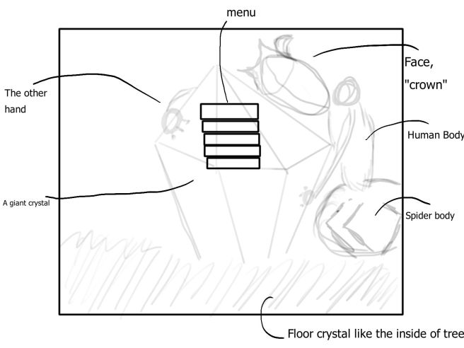
Our project is a shoot ‘em up game. The theme of game revolves around a world of stone “trees” that have a structure of a geode; stone on the outside and a crystal hollow core. All of the creatures of the world live inside of these “trees”. And the energy of the world is in the crystals. In this game the avatar Betulla, a mix of a spider and a humanoid, climbs the inside of the tree trunk in search of places that are concentrations of energy.

The sketch you see on the screen is my attempt to show my team how a health bar in our game can look like. Disregarding the awful visuals of it, as I am not an artist, there is actually a lot of thought put into this. Let’s go thought different elements and my thinking:

-The positioning: The edges of our screen (as seen in the drawing) are filled with the edge of the tree trunk. So, if we place the player’s feedback outside of the tree it will shrink our playing space even more. It makes more sense to place health bar at the bottom, especially since the avatar can’t walk back down the tree in our design.

-Player feedback: In our game, we decided to make the health of the avatar the ammunition. This let us to the concept of “energy is everything”. You consist of this energy, you use this energy as the weapon. This would require a very dynamic meter that can fast reflect the change in the resource. This type of bar is easy to use as both a health meter and ammo meter. However, there is still space to place a numeric value for people who prefer a solid information instead of abstract symbolism.

-Aesthetics: I can poorly capture the aesthetical possibilities of this sketch, but I can try to explain what I wanted to show. To me, it is important for the health bar to be associated with our avatar. I tried to do that through turning the left side of the bar into a resemblance of a spider leg. This is the lowest life point, it is narrow, this makes me feel the accent of how little health you have. The right side in my drawing has a “cap” that can make connection to the avatar even stronger, like an object belonging to the avatar or the shape of her hairdo. I also want our health bar to reflect the contrast between the crystal containing life energy and the crystal that is empty.